Redesign: DoorDash
Reimagining DoorDash as a company that delivers a multitude of things right to your door.
A couple of my friends at DoorDash told me about how DoorDash isn’t a food delivery app, it’s a logistics company. That struck me as quite interesting because I felt that most people I knew, including myself, thought of DoorDash as just another food delivery service (if they even knew what it was at all). As an active user of the app, I thought it'd be a fun to reimagine what DoorDash would be like once they start to tackle verticals outside of food.
Brand Research:
In the words of DoorDash CEO, Tony Xu, DoorDash uses “technology to build a marketplace that gives back to the local economy.” When I think of the spirit of DoorDash, I think of a company that’s friendly, accountable and cares about its customers. It’s like a neighbor running an errand for me when I’m busy and dropping off whatever I needed at my front door with a smile. I knew off the bat that I wanted my rebrand to reflect that. After talking with some DoorDash employees and reading through their online blog, I chose to implement a new color palette in order to better reflect their company identity. According to color psychology, the color yellow represents warmth and friendliness and the color blue represents loyalty and responsibility. Those qualities and colors perfectly represent DoorDash as a company.
User Research:
In general, DoorDash users are busy, young professionals that don’t mind paying a little extra for convenience. They’re energetic, tech-savvy and often juggling many responsibilities — whether its putting in an extra couple hours on that side project or running a little late to that yoga class. I knew I wanted to redesign DoorDash with them in mind. After several user interviews, I found that the people who did know about DoorDash actually didn't mind their user experience much as is. However, they had no idea that DoorDash was technically a logistics company and they never would have imagined that DoorDash would be able to deliver anything from groceries to alcohol, right to their door. I wanted to make sure that I maintained the ease and simplicity of DoorDash's user flow, while adding in the complexity of having multiple categories of items for the user to navigate through.
Competitive Research:
DoorDash isn’t the only company in the delivery space. I wanted my rebrand to help set DoorDash apart. For many users, its red and white branding implies food delivery, as it resembles many companies in that space — GrubHub, Eat24 / Yelp, Seamless. But that’s not all that DoorDash does and I didn’t want its branding limiting its potential. It was important for me to make sure that my new DoorDash branding would look different from those companies and from companies that are in the delivery space like Postmates, Uber, and Instacart while still remaining true to its identity.
* None of this work is directly affiliated with DoorDash and was created purely as a design / branding experiment
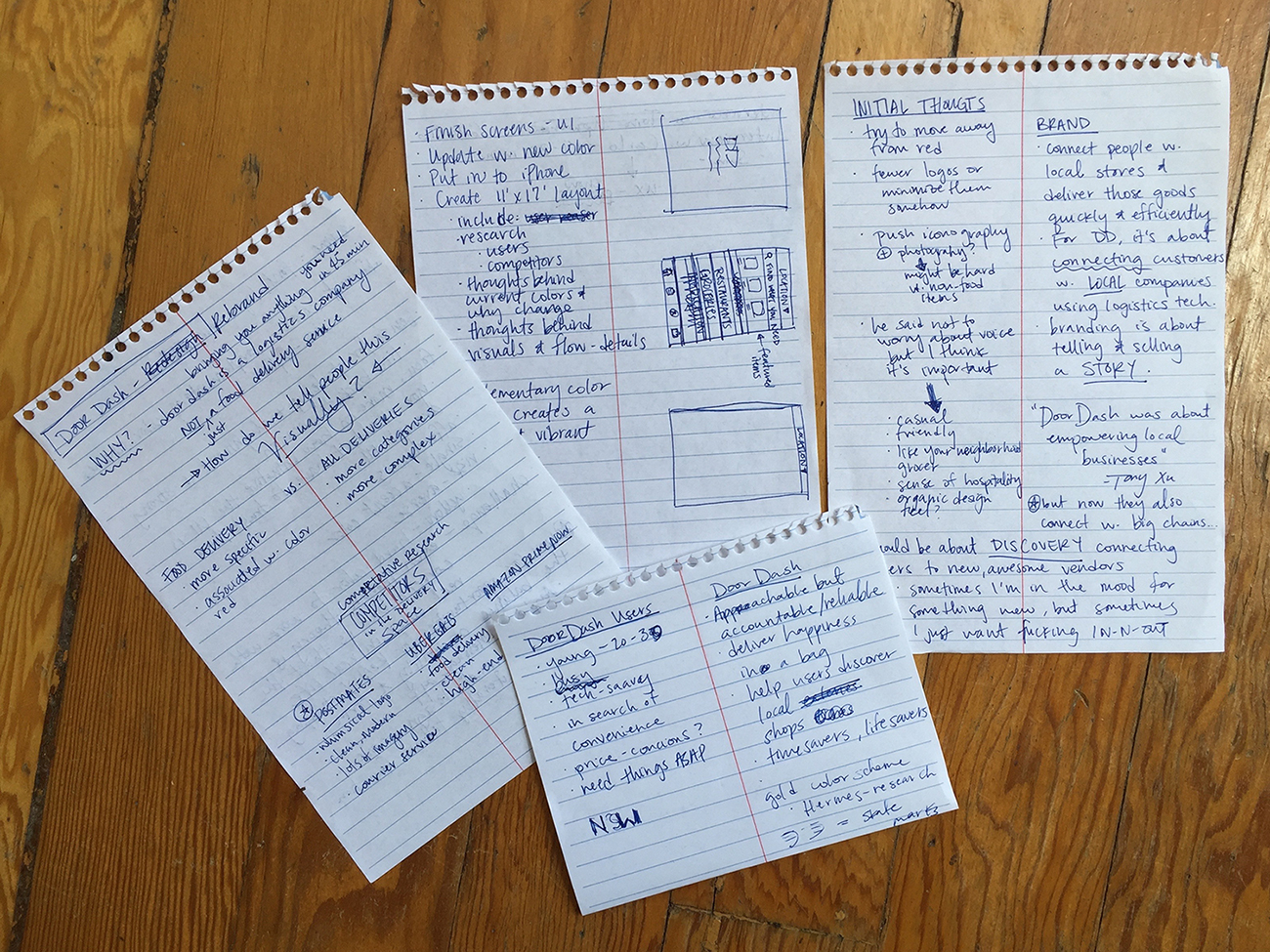
Notes about DoorDash users, their current brand identity and how to find a solution to the shift they want to make.
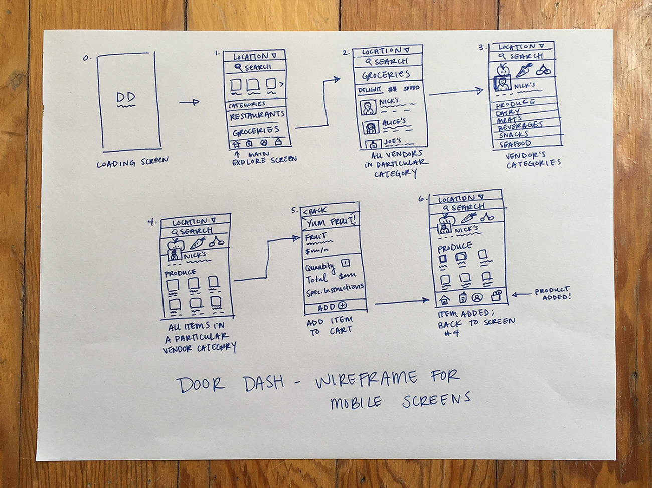
Mobile wireframe sketch

Color & design exploration
Solution:
Create a new visual language that embodies the spirit of DoorDash and keeps its users at the forefront. It should be friendly, trustworthy and responsible without being boring. It should also highlight local stores first, encouraging users to buy directly from the shops in their neighborhood. Additionally, this identity should be intuitive, modern and visually distinct from the branding of DoorDash’s direct and indirect competitors.
Create a new visual language that embodies the spirit of DoorDash and keeps its users at the forefront. It should be friendly, trustworthy and responsible without being boring. It should also highlight local stores first, encouraging users to buy directly from the shops in their neighborhood. Additionally, this identity should be intuitive, modern and visually distinct from the branding of DoorDash’s direct and indirect competitors.
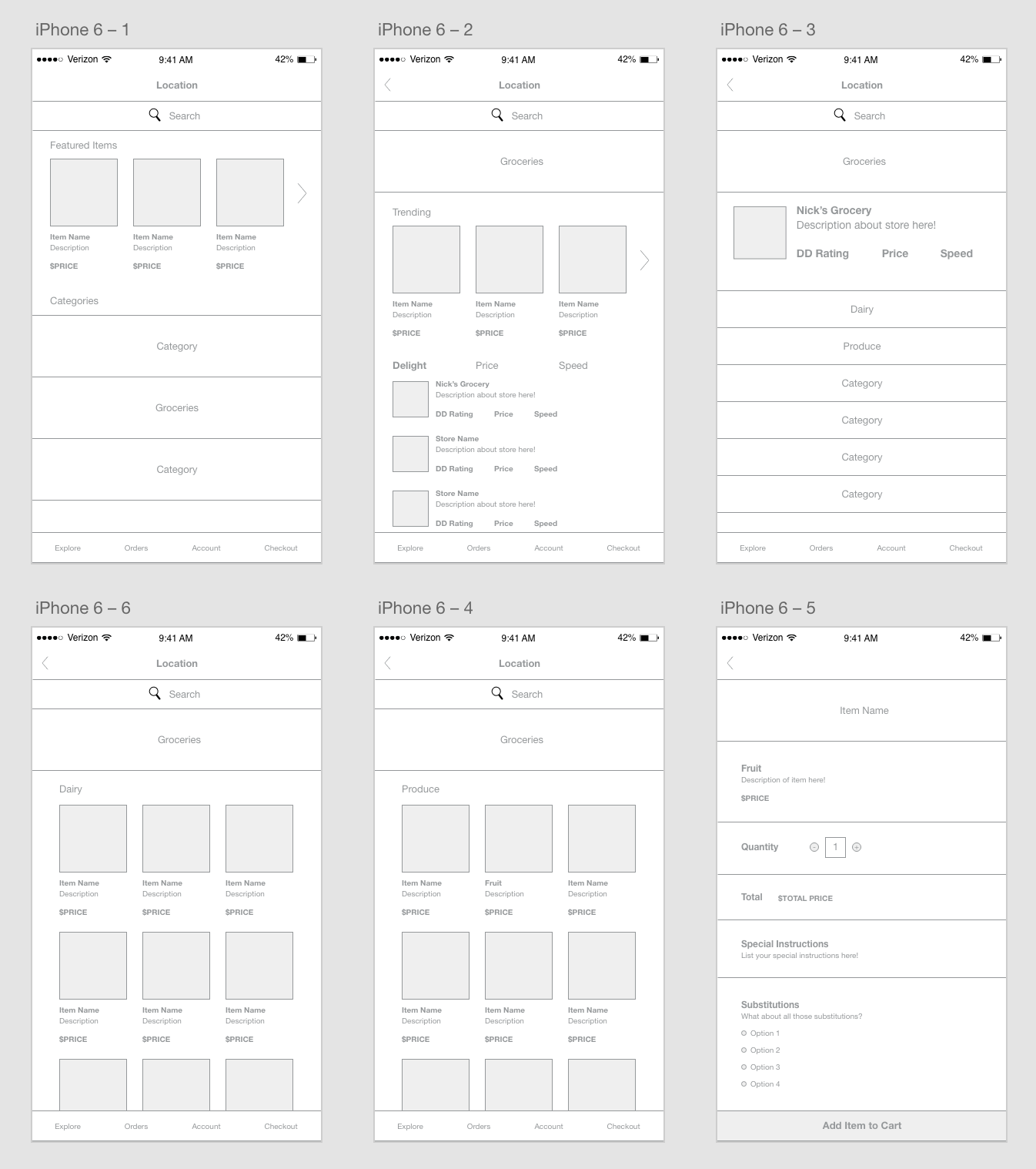
Digital wireframes

Sample of draft screens
A couple issues I ran into based with the original comps: the text was too small for mobile, the yellow was getting lost in low-light or daylight settings, and the categories didn't read as tapable elements.
After further prototyping, I came up with a new set of mocks to fix the issues mentioned above. I increased the text size across all screens, minimized the yellow and used it solely as a highlight color and created large, tapable targets of imagery for each category. I also reviewed the user experience and removed featured / trending items because it seemed to be removing the users from the experience. Also, I maintained a constant search functionality in a more minimal way so that users would be able to search for the right products from any screen where it seemed appropriate.
The final product can be seen below.
Link to prototype: https://invis.io/KE81ICFQX

Final Screens
